Code
library(plotly)
library(gganimate)
library(knitr)
library(kableExtra)
library(tidybayes)
library(posterior)
library(bayesplot)
library(cmdstanr)
library(tidyverse)library(plotly)
library(gganimate)
library(knitr)
library(kableExtra)
library(tidybayes)
library(posterior)
library(bayesplot)
library(cmdstanr)
library(tidyverse)The goal of this document is to —. We’ll use Model 5 from the simple linear regression example illustrating program blocks.
Recall the data is of the form \[ y_i = \alpha + \beta x_i + \epsilon_i, \;\;\;\;\;i = 1, \ldots, n, \tag{1}\]
and we used true values \(\alpha = 2\), \(\beta = 3\), and \(\sigma = 6\) to simulate some data:
set.seed(4384836)

n <- 30

alpha <- 2
beta <- 3
sigma <- 6

data <- tibble(x = runif(n, 20, 30)) %>%
  mutate(y = rnorm(n(), alpha + beta*x, sigma))

data %>%
  ggplot(aes(x = x, y = y)) +
  geom_point()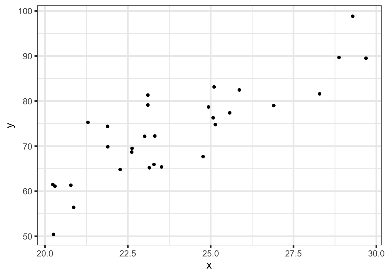
We’ll write down the full statistical model:
\[ \begin{align} Y_i \; | \; \alpha, \beta, \sigma &\sim Normal(\alpha + \beta x_i, \; \sigma) \\ \alpha &\sim Normal(\mu_\alpha, sd_\alpha) \\ \beta &\sim Normal(\mu_\beta, sd_\beta) \\ \sigma &\sim Half-Normal(\mu_\sigma, sd_\sigma) \\ \end{align} \] And we will assume weakly informative priors with hyperparameters as follows:
| Hyperparameter | Value |
|---|---|
| \(\mu_\alpha\) | 0 |
| \(sd_\alpha\) | 30 |
| \(\mu_\beta\) | 0 |
| \(sd_\beta\) | 10 |
| \(\mu_\sigma\) | 0 |
| \(sd_\sigma\) | 15 |
Recall the model:
functions{

  vector calculate_mu(real intercept, real slope, vector x){

    vector[num_elements(x)] mu = intercept + slope*x;
    return mu;

  }

}
data{

  int<lower = 1> n;
  array[n] real y;
  vector[n] x;

  real mu_alpha, mu_beta, mu_sigma;
  real<lower = 0> sd_alpha, sd_beta, sd_sigma;

  int<lower = 1> n_pred;
  vector[n_pred] x_pred;

}
parameters{

  real alpha;
  real beta;
  real<lower = 0> sigma;

}
transformed parameters{

  vector[n] mu = calculate_mu(alpha, beta, x);

}
model{

  // Priors
  alpha ~ normal(mu_alpha, sd_alpha);
  beta ~ normal(mu_beta, sd_beta);
  sigma ~ normal(mu_sigma, sd_sigma);

  // Likelihood
  y ~ normal(mu, sigma);

}
generated quantities{

  // PPC - mu is still accessible here, so it doesn't need to be calculated again
  array[n] real y_ppc = normal_rng(mu, sigma);

  // Predictions at new points
  vector[n_pred] y_pred_mean = calculate_mu(alpha, beta, x_pred);
  array[n_pred] real y_pred = normal_rng(y_pred_mean, sigma);

  // Log-likelihoods of individual observations
  vector[n] log_lik;
  for(i in 1:n){
    log_lik[i] = normal_lpdf(y[i] | mu[i], sigma);
  }

}Pre-process the data, define your hyperparameters, compile the model, and fit it:
## model <- cmdstan_model("path/to/your/stan/file.stan")

# New points at which to predict
x_pred <- seq(20, 30, by = 0.1)

stan_data <- list(n = nrow(data),
                  y = data$y,
                  x = data$x,
                  mu_alpha = 0,
                  sd_alpha = 30,
                  mu_beta = 0,
                  sd_beta = 10,
                  mu_sigma = 0,
                  sd_sigma = 15,
                  n_pred = length(x_pred),
                  x_pred = x_pred)

fit <- model$sample(data = stan_data,
                    seed = 112358,
                    chains = 4,
                    parallel_chains = 4,
                    iter_warmup = 1000,
                    iter_sampling = 1000,
                    adapt_delta = 0.8,
                    refresh = 0,
max_treedepth = 10)There is an endless amount of analysis we can do with our (samples from the) posterior distribution. Here we will focus on basic posterior summaries of parameters and predictions. Particularly relevant to this section is the bayesplot vignette on plotting MCMC draws.
First, let’s just look at what we have (after wrangling it to get it into a nicer format). The following table shows the actual values for each variable for each draw in our MCMC sample:
draws_df <- fit$draws(format = "draws_df")

draws_df %>%
  ungroup() %>%
  mutate(across(where(is.numeric), \(x) round(x, 3))) %>%
  group_by(.chain) %>%
  slice_head(n = 10) %>%
  relocate(starts_with("."), .after = "lp__") %>%
DT::datatable() This table shows only the first 10 draws from each chain for readability purposes. There are actually \(4\;(chains) \times 1000 \; (iter\_sampling) = 4000\) draws in our sample.
We can look at some numerical summaries of the parameters:
We should look at some MCMC diagnostics first, but we’ll just assume everything looks fine for now.
summary <- summarize_draws(fit$draws(c("alpha", "beta", "sigma")),
                           mean, median, sd, mcse_mean,
                           ~quantile2(.x, probs = c(0.025, 0.975)), rhat,
                           ess_bulk, ess_tail)

summary %>%
  mutate(rse = sd/mean*100) %>%
  select(variable, mean, sd, mcse_mean, q2.5, median, q97.5, rse, rhat,
         starts_with("ess")) %>%
  mutate(across( -c(rhat, variable), \(x) round(x, 2)),
         rhat = round(rhat, 3),
         variable = str_c('$\\', variable, '$')) %>%
  knitr::kable(col.names = c("Variable", "Mean", "Std. Dev.", "$MCSE_{mean}$", "2.5%",
                             "Median", "97.5%", "RSE", "$\\hat{R}$", "$ESS_{Bulk}$",
"$ESS_{Tail}$")) | Variable | Mean | Std. Dev. | \(MCSE_{mean}\) | 2.5% | Median | 97.5% | RSE | \(\hat{R}\) | \(ESS_{Bulk}\) | \(ESS_{Tail}\) |
|---|---|---|---|---|---|---|---|---|---|---|
| \(\alpha\) | -5.11 | 9.32 | 0.29 | -23.77 | -4.90 | 13.34 | -182.37 | 1.005 | 1181.84 | 767.67 |
| \(\beta\) | 3.27 | 0.39 | 0.01 | 2.50 | 3.27 | 4.04 | 11.87 | 1.005 | 1212.17 | 768.00 |
| \(\sigma\) | 5.86 | 0.83 | 0.02 | 4.53 | 5.76 | 7.76 | 14.16 | 1.002 | 1489.87 | 1428.21 |
Or you can look at density plots of the parameters:
mcmc_dens(fit$draws(c("alpha", "beta", "sigma")),
          facet_args = list(labeller = ggplot2::label_parsed))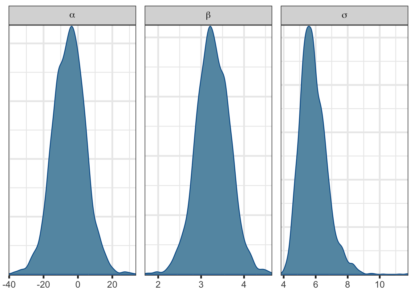
Or a pairs plot to see pairwise joint distributions:
It’s beyond the scope of this page, but notice the high correlation between \(\alpha\) and \(\beta\) and the high uncertainty and MCSE in \(\alpha\) in Table 2. That’s why we centered \(x\) in Model 6 (and for interpretability). You’ll see a much nicer posterior distribution if you fit that one. Try it!
mcmc_pairs(fit$draws(c("alpha", "beta", "sigma"))) 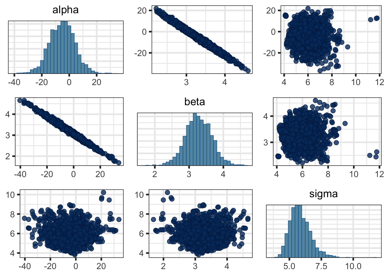
pairs_plot <- mcmc_pairs(fit$draws(c("alpha", "beta", "sigma")))

pairs_plot$bayesplots[[1]] <- pairs_plot$bayesplots[[1]] +
  labs(subtitle = latex2exp::TeX("$\\alpha$"))
pairs_plot$bayesplots[[5]] <- pairs_plot$bayesplots[[5]] +
  labs(subtitle = latex2exp::TeX("$\\beta$"))
pairs_plot$bayesplots[[9]] <- pairs_plot$bayesplots[[9]] +
  labs(subtitle = latex2exp::TeX("$\\sigma$"))

bayesplot_grid(plots = pairs_plot$bayesplots)
3-D plots are generally considered bad practice, and I don’t particularly find 3-D plots all that useful - they’re just too hard to see and interpret, but you can make that decision for yourself.
You can also look at 3-dimensional plots1, although they’re not easy to interpret.
fig <- plot_ly(draws_df,
               x = ~alpha, y = ~beta, z = ~sigma) %>%
  add_markers(marker = list(opacity = 0.5,
                            size = 2)) %>%
  layout(scene = list(xaxis = list(title = 'alpha'),
                      yaxis = list(title = 'beta'),
                      zaxis = list(title = 'sigma')))


fig <- plot_ly(type = "scatter3d", mode = "markers") %>%
  add_trace(x = draws_df$alpha, y = draws_df$beta, z = draws_df$sigma,
            text = paste0("</br>\u03B1: ", draws_df$alpha,
                          "</br>\u03B2: ", draws_df$beta,
                          "</br>\u03C3: ", draws_df$sigma),
            hoverinfo = "text",
            marker = list(size = 2,
                          opacity = 0.5,
                          color = "blue")) %>%
  layout(title = "3D Joint Posterior",
         scene = list(xaxis = list(title = "\u03B1"),
                      yaxis = list(title = "\u03B2"),
                      zaxis = list(title = "\u03C3")))

figThe main point of this is to show that we have a joint posterior that we can’t visualize when looking at only the basic marginal density and pairwise joint density plots.
The most basic idea of a posterior distribution is that it describes how likely a given combination of parameters is conditional on the data. For our example, a parameter combination \(\{\alpha, \beta, \sigma\} = \{-5, 3.2, 6\}\) seems to be fairly likely, \(\{-20, 4, 6\}\) is possible but less likely, and \(\{-20, 3.2, 6\}\) is for all intents and purposes impossible. While it is informative to look at numerical summaries and marginal and pairwise joint posteriors, we have to be go beyond these plots and summaries to get the bigger picture.
In Section 5 we looked at the posterior distribution on the parameter scale. If we simulate data using draws from our posterior distribution, then we can visualize the posterior distribution on the data scale - this is precisely what we have done with y_pred_mean (posterior predicted means) and y_pred (posterior predictions = posterior predicted mean + error)2.
Since the posterior distribution weights each possible combination of \((\alpha, \beta, \sigma)\) based on how likely it is conditioned on the observed data, the predictions derived/simulated from these parameter combinations are also weighted based on how likely they are (conditioned on the observed data).
After collecting data, we have fit a model and sampled from the posterior (and posterior predictive) distribution. Now we can do some visualizations.
We’ll first look at the posterior predicted mean - basically \(p(\alpha + \beta \tilde{x} \; | \; y)\) for our grid of new \(\tilde{x}\) (x_pred) with varying levels of probability intervals:
preds_df <- draws_df %>%
  spread_draws(c(y_pred_mean, y_pred)[i]) %>%
  ungroup() %>%
  mutate(x_pred = stan_data$x_pred[i])

preds_df %>%
  ggplot() +
  stat_lineribbon(aes(x = x_pred, y = y_pred_mean)) +
  geom_point(data = data,
             mapping = aes(x = x, y = y)) +
  scale_fill_brewer() +
  ylab("y") +
  xlab("x")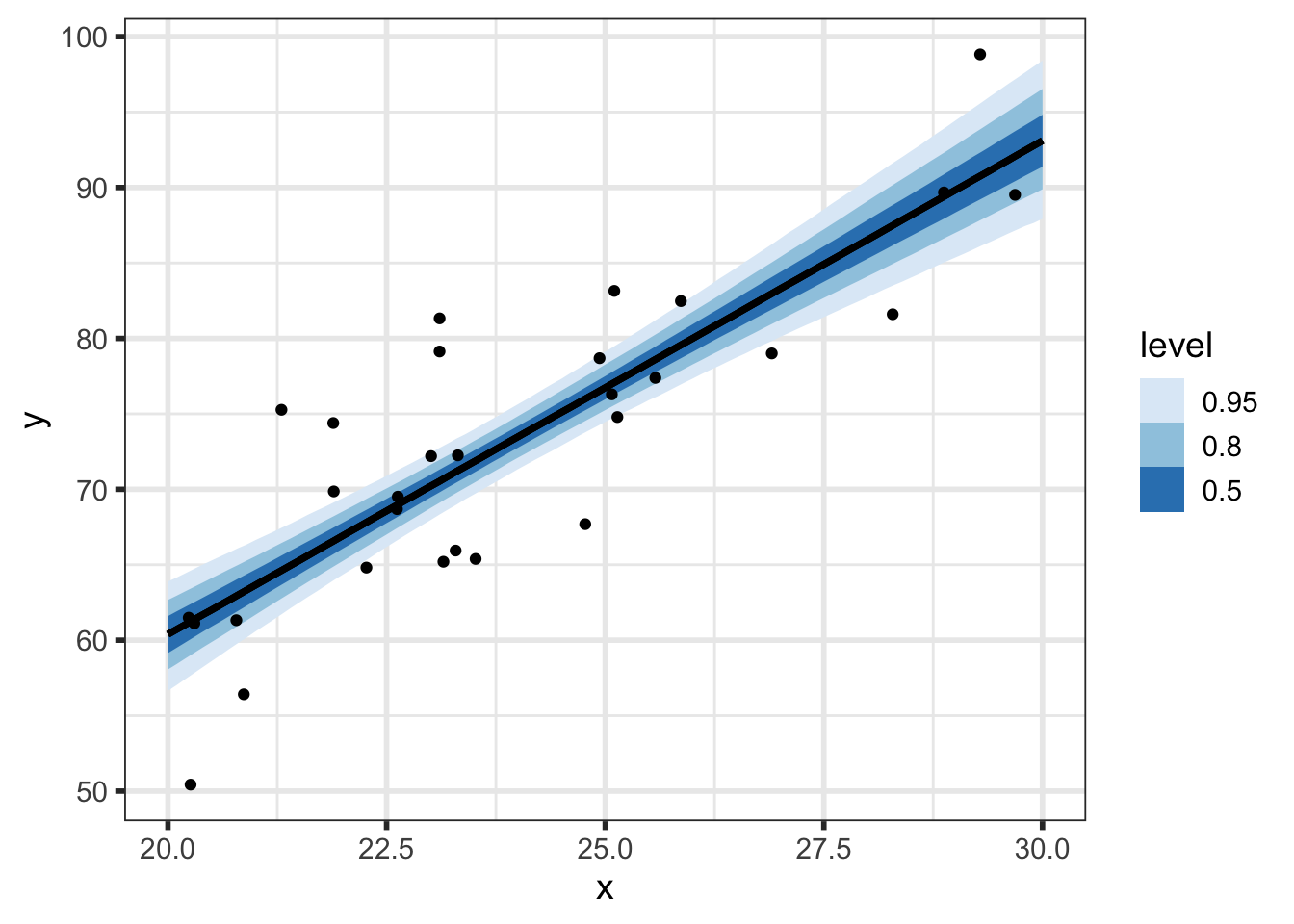
But we can do even better to visualize how our parameters relate to our predictions. We know that the \(i^{th}\) draw of parameters from the posterior, denoted \((\alpha^{[i]}, \beta^{[i]}, \sigma^{[i]})\), has been transformed to the data space by y_pred_mean\(\!^{[i]}=\alpha^{[i]} + \beta^{[i]}\tilde{x}\) and y_pred\(\!^{[i]}=\) y_pred_mean\(\!^{[i]} + \epsilon, \;\; \epsilon \sim N(0, \sigma^{[i]})\), so we now have draws of y_pred and y_pred_mean.
(p_pred_mean_spaghetti <- preds_df %>%
  group_by(.chain) %>%
  filter(.iteration <= 10) %>%
  ggplot() +
  geom_line(aes(x = x_pred, y = y_pred_mean, group = .draw), color = "blue") +
  geom_point(data = data,
             mapping = aes(x = x, y = y)) +
  ylab("y") +
  xlab("x") +
  transition_states(.draw, 0, 1) +
  shadow_mark(future = TRUE, color = "gray50", alpha = 0.075))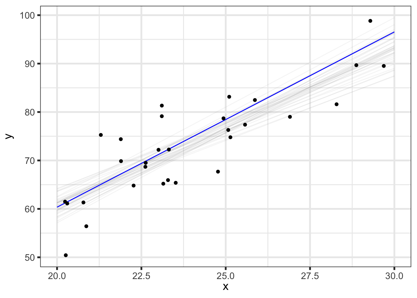
We can look at prediction intervals with varying levels of probability intervals:
preds_df %>%
  ggplot() +
  stat_lineribbon(aes(x = x_pred, y = y_pred)) +
  geom_point(data = data,
             mapping = aes(x = x, y = y)) +
  scale_fill_brewer() +
  ylab("y") +
  xlab("x")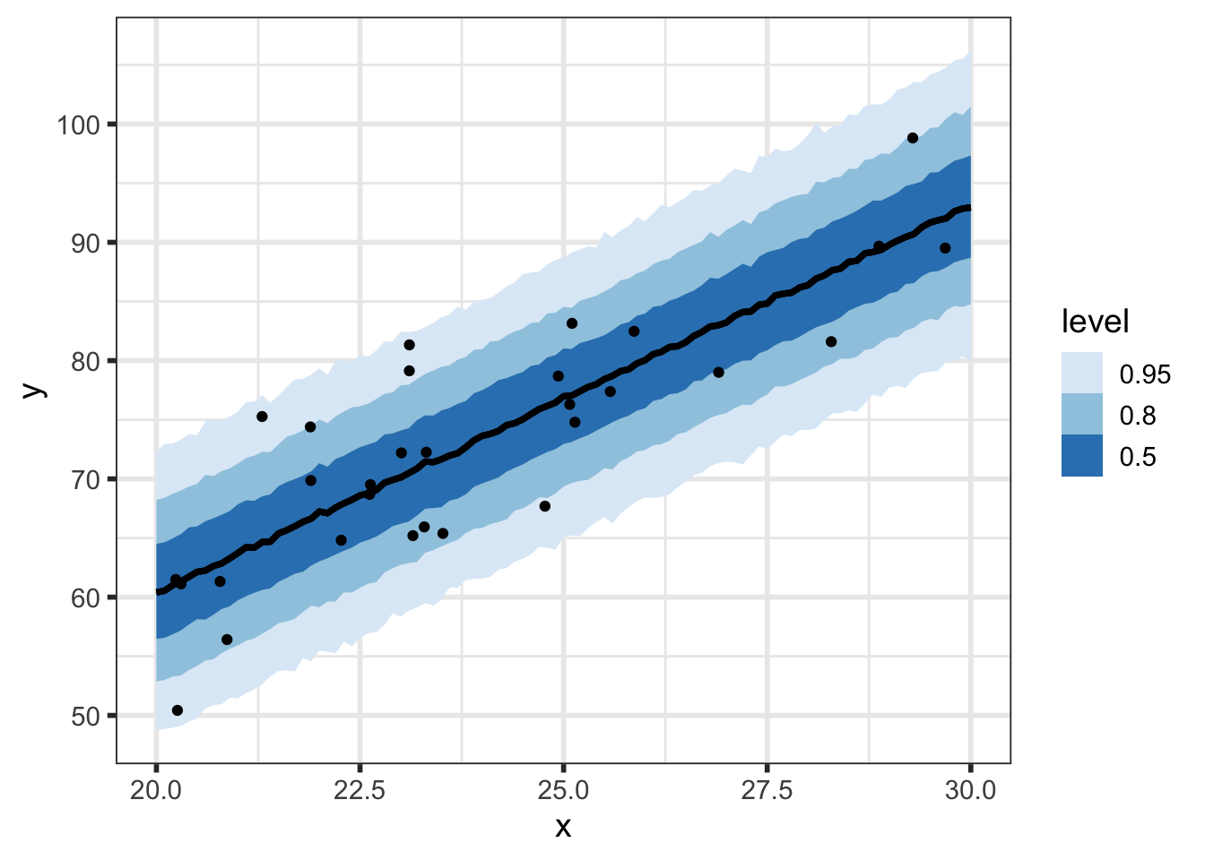
At every value of \(\tilde{x}\), we have a posterior predictive distribution. Here’s what that looks like for a select few values of \(\tilde{x}\):
{preds_df %>%
  filter(x_pred %in% seq(20, 30, by = 2))} %>%
  ggplot() +
  geom_line(. %>%
              group_by(x_pred) %>%
              summarize(mean = mean(y_pred_mean)),
            mapping = aes(x = x_pred, y = mean)) +
  stat_halfeye(aes(x = x_pred, y = y_pred, group = x_pred),
               scale = 0.5, interval_size = 2, .width = 0.95,
               point_interval = mean_qi, normalize = "xy",
               alpha = 0.2, fill = "blue") +
  geom_point(data = data,
             mapping = aes(x = x, y = y)) +
  ylab("y") +
  xlab("x") +
  coord_cartesian(ylim = c(30, 120))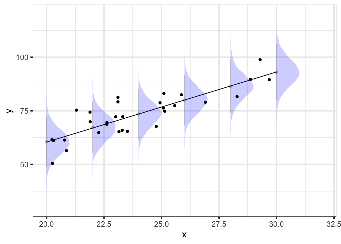
As an aside, this plot should illustrate the difference between the posterior predicted mean (red) and posterior predictions (blue) - the intervals are much bigger for the predictions to the addition of residual variability.
{preds_df %>%
  filter(x_pred %in% seq(20, 30, by = 2))} %>%
  ggplot() +
  geom_line(. %>%
              group_by(x_pred) %>%
              summarize(mean = mean(y_pred_mean)),
            mapping = aes(x = x_pred, y = mean)) +
  stat_halfeye(aes(x = x_pred, y = y_pred, group = x_pred),
               scale = 0.5, interval_size = 2, .width = 0.95,
               point_interval = mean_qi, normalize = "xy",
               alpha = 0.2, fill = "blue") +
  stat_halfeye(aes(x = x_pred, y = y_pred_mean, group = x_pred),
               scale = 0.75, interval_size = 2, .width = 0.95,
               point_interval = mean_qi, normalize = "xy",
               alpha = 0.2, side = "left", fill = "red") +
  geom_point(data = data,
             mapping = aes(x = x, y = y)) +
  ylab("y") +
  xlab("x") +
  coord_cartesian(ylim = c(30, 120))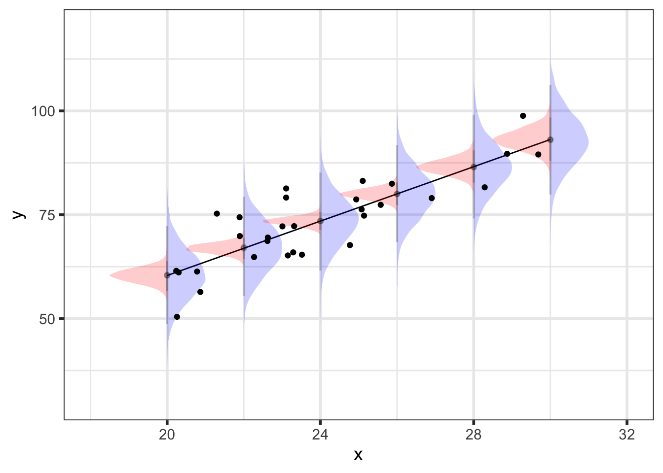
Hopefully this document gives you a bit more understanding of the posterior distribution and how it relates to posterior predictions.